Solar System Vortex Video: What It Gets Right and Wrong
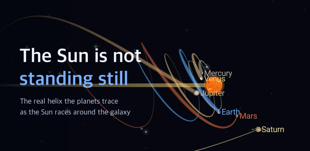
That solar system vortex clip has been doing the rounds for well over a decade: the Sun shoots forward, the planets coil behind it like a spring, and the caption tells you everything you learned at school was a lie. Roughly half of it is right and the other half is not, and the clip never tells you which half is which. I wanted to see the real shape for myself, so I wrote a solar system simulator where you tilt the camera with your own finger and read the numbers straight off the screen.
Most of the work turned out not to be drawing. It was deciding where I was allowed to exaggerate and where a single bent number would turn the whole picture into a lie.
▶ Get it on Google Play (free): https://play.google.com/store/apps/details?id=com.thefacegood.solaraction
The solar system vortex video, checked against measured numbers
Start with what the clip gets right. The Sun is not parked. It goes around the centre of the Milky Way at roughly 230 km/s, and one lap takes about 230 million years, a stretch astronomers call a galactic year. So if you track Earth's real path, using the galaxy as your fixed frame instead of the Sun, the path is not a closed circle. It is a helix. That part is true.
Now the parts that are not. In the clip the orbital plane stands at a right angle to the direction the Sun is travelling, which is what makes the whole thing look like a drill bit. The measured tilt is about 60 degrees, so the real thing leans over. And the spring is nowhere near that tight: during one Earth orbit the Sun moves about 24 times the diameter of Earth's orbit. Stretch a coil to 24 times its own width and you no longer have a spring. You have a gently waving line.
The app has a screen with both angles side by side. I locked the camera edge-on to the orbital plane, so the angle between the blue orbit and the yellow direction arrow really is 60 degrees on one side and 90 on the other.
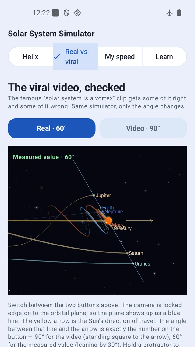
Tilt the camera and the circles unwind into a helix
The textbook diagram is one camera angle: straight down onto the orbital plane, Sun in the middle, planets on neat concentric rings. Nothing about it is wrong. It just leaves out where everything is heading. All this app really does is let you take that camera and tip it over. Drag the horizontal and vertical sliders and the rings loosen; keep going and the planets trace a helix while the Sun races around the galaxy. Turn it with a finger, or press the Angle button and the app glides between the two views on its own.
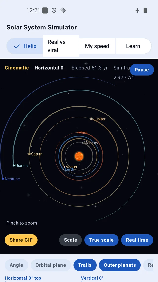
I made that transition deliberately slow. This is the moment the app exists for, and I wanted the eye to be able to follow each ring as it opens. You can choose how many orbits of history to draw and how fast time runs; push the speed up and decades pass in seconds.
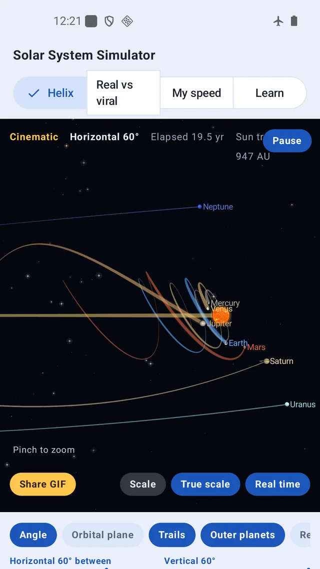
True scale: the day every planet became a dot
Here is where I lost the most time. My first version had a button that switched only the distances to their real ratio. It looked wrong in an interesting way: Mercury coiled about 18 times tighter than it should, because I had squeezed the orbit radii to fit the screen and then let the Sun travel its real distance. Change one ruler and not the other, and the drawing starts lying immediately.
So I made the button change both. That fixed the shape and produced a new problem: once Neptune's orbit spans the whole screen, the Sun is 0.17 pixels across and Jupiter is 0.017. At true scale, the only honest way to draw a planet is as a dot. The surprise is that the least straight path belongs to Mercury, and the outer planets get flatter and flatter until Neptune is very nearly a line, which is the opposite of what the compressed view suggests. Mercury laps the Sun in 88 days, so the Sun barely moves in that time; Neptune takes 165 years, and the Sun covers about 8,000 AU meanwhile.
That is why the default view is deliberately squashed. There is no setting where all eight planets coil prettily on one screen, because that picture does not exist. What I refused to touch is the orbital periods. The gap in speed from planet to planet is the very thing that twists the helix, so those numbers stay exact, and the ruler currently in use is always written in the corner.
Sitting still at 230 km/s
Read this sentence without moving and you are still doing four things at once. Earth spins at about 0.46 km/s at the equator, orbits the Sun at 29.8 km/s, the Sun rounds the galaxy at 230 km/s, and everything together drifts at roughly 370 km/s relative to the cosmic microwave background. The app counts all four from the moment you open the screen. Press Real time and the clock runs at 1:1: the picture appears to freeze while the Sun quietly covers 13,800 km every minute. Enter your birthday and it turns your lifetime's travel into a card you can share.
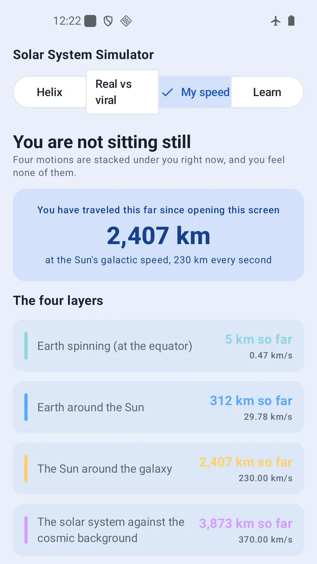
A handful of short cards explain the rest: what a galactic year is, which way the Sun is going, why you feel none of this, and why the inner planets and the outer ones draw such different shapes.
Who this is for
- Anyone who watched the vortex clip and wanted to know how much of it holds up
- Parents who got stuck explaining the solar system to a child and want a second camera angle
- Students who learned the flat diagram and never saw the third dimension
- Anyone who prefers an app that shows its numbers instead of hiding them
It works with no internet connection, collects no personal data, and runs every calculation on the phone. It is free, with ads. You can also record whatever you are looking at as a three second animated GIF and share it.
Download (Google Play, free): https://play.google.com/store/apps/details?id=com.thefacegood.solaraction
※ Every figure is taken from NASA's planetary fact sheets or from IAU values. The app lays measured numbers side by side; it passes no verdict on any particular video or its maker.
I learned a surprising amount building this, mostly by being wrong first. If you spot a number that looks off or a view you wish existed, leave a review and tell me. The next version is shaped by exactly that.


Comments
Post a Comment