How Far Is Voyager 1? Swipe the Whole Distance at One Scale
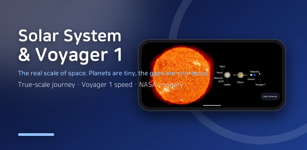
How far is Voyager 1 right now? I have typed that question into a search box more times than I can count, and the answer always comes back as a number with too many zeros: more than 24 billion kilometres, well past 160 times the Earth-Sun distance, still leaving at 17 km/s. I believed the number. I just could not feel it. So I built an app where you swipe that entire distance with your thumb, at a single scale, from the Sun past all eight planets to the small space probe waiting at the far end.
▶ Get it on Google Play (free): https://play.google.com/store/apps/details?id=com.thefacegood.spacevoy
How far is Voyager 1, really? Numbers versus a thumb
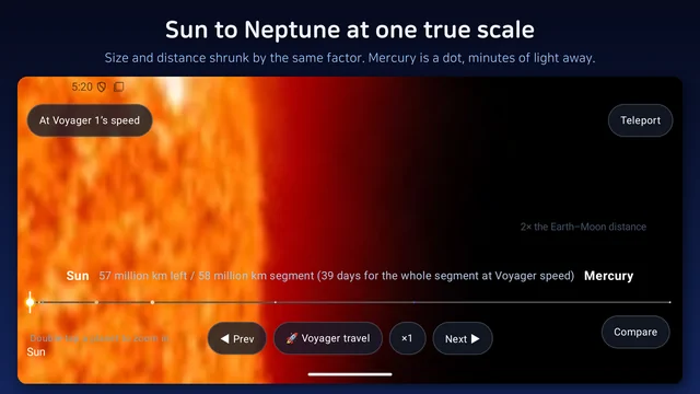
Almost every solar system picture cheats in the same way. The planets are drawn at something close to their true relative sizes, and then the distances between them are quietly squashed so everything fits on one page. The result is a solar system that looks like a row of houses on a street. It is nothing like that. If Mercury is a fingernail-sized dot on your screen, the next planet is several screens away, and Neptune is a long, boring, empty swipe from anywhere.
In this app, shrinking the sizes shrinks the gaps by precisely the same factor. There is no separate cheat for the gaps. Swipe all the way out and you can, quite literally, "see how far the probe has actually gone": past every planet, past the place where the Sun's wind gives out, into interstellar space. Every leg carries human-scale hints so the numbers land: this many light-minutes from the Sun, this many times the Earth-Moon distance. That emptiness is what I wanted people to feel, because the emptiness is what space actually is.
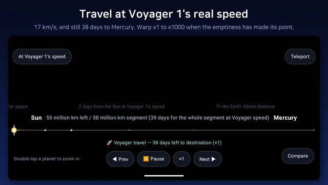
Travel at Voyager 1 real speed, or warp
The HUD in the top-left corner shows the probe's actual speed: 17 km/s, or 61,200 km/h. As you cross each leg, the app tells you how many years and days Voyager would need to cover it at that speed. Sun to Jupiter is a matter of a couple of years; the stretch beyond Neptune is measured in decades. You can travel at Voyager 1 real speed, which is a humbling way to appreciate that nobody is going anywhere quickly, or you can warp anywhere from x1 to x1000 and compress those decades into something a coffee break can hold. Pause, resume and instant teleport are all there for when the emptiness has made its point.
The story in six chapters, and the close-ups
The app opens with the journey of Voyager 1 told in six short chapters: launch in 1977, Jupiter in 1979, Saturn in 1980, the Pale Blue Dot photograph of 1990, the Golden Record bolted to its side, and the crossing into interstellar space in 2012. It is skippable, but I would read it once, because it explains why a space probe gets to sit at the end of a solar system map like a ninth planet.
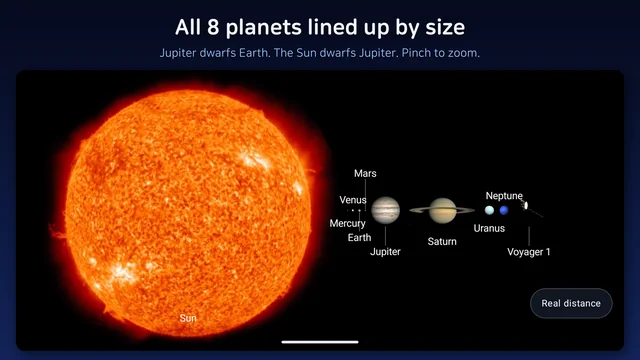
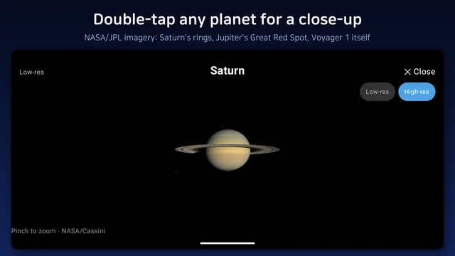
Two more views live alongside the main journey. Compare view sets distance aside and lines the planets up by size alone, which is the fastest way to see how enormous Jupiter and Saturn are and how small Earth is beside them; pinch to zoom in. And double-tapping any planet opens a large close-up: Saturn's rings, Jupiter's Great Red Spot, Earth's blue oceans, and Voyager 1 itself at the edge. The imagery is public-domain material released by NASA and JPL, and the app is not affiliated with either.
Two decisions that shaped it
The first was refusing a "squashed" mode. It would have been easy to add a view where the planets sit close together so nobody has to swipe for long, and it would have quietly undone the only thing the app is for. If the gaps are not real, the journey is a scrolling list with planets on it. So there is no such mode; the compare view exists for size, and the journey exists for distance, and neither one borrows from the other.
The second was going landscape only. A phone held sideways gives the journey the widest strip of screen it can get, and the empty stretches between planets read as empty rather than as a short scroll. It is a small constraint that makes the whole thing feel like distance instead of a list.
Who this is for
- Anyone who has searched for how far Voyager 1 is and wanted to feel the answer rather than read it
- Parents who want to show a child the real gaps between planets without a lecture
- Teachers looking for a visual for the solar system unit or the history of space exploration
- Anyone curious what "the most distant human-made object" actually means
Core features work offline; the network is used only for the high-resolution close-ups. It is landscape only, on purpose. It is free, with ads.
Download (Google Play, free): https://play.google.com/store/apps/details?id=com.thefacegood.spacevoy
※ All eight planets, the Sun and Voyager 1 are shown with public-domain NASA/JPL imagery. The app is not affiliated with, endorsed by or sponsored by NASA or JPL.
If a leg feels wrong or a figure looks out of date (the probe keeps moving, after all), leave a review and I will check the numbers against the source and update the app.


Comments
Post a Comment