Solar System to Scale: Why Every Textbook Diagram Lies
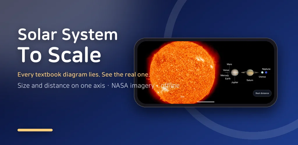
Make Mercury five millimetres wide. At that scale the Sun is about a metre and a half across, Earth is a little over a centimetre, and Neptune sits roughly six and a half kilometres down the road. Now try to draw that on one page. You cannot, and that is why every textbook picture of the solar system to scale is quietly cheating: it draws the planets at a believable size and then squeezes the gaps to fit the paper.
I wanted a version that refuses to cheat. RealSpace is a small Android app that draws the Solar System with planet size and distance locked to one true scale. Shrink the planets and the distances shrink by exactly the same factor, which means most of what you see is empty space. That emptiness is the point.
▶ Get it on Google Play (free): https://play.google.com/store/apps/details?id=com.thefacegood.spacereal
The solar system to scale: shrink size and distance together
The main screen lays out the Sun through Neptune on a single axis. There is no separate zoom for size and another for distance; one number controls both. The first time I scrolled it on my own phone I honestly thought the rendering had broken, because after Mars there was nothing on screen for what felt like ages. Then Jupiter arrived. That is the moment the app is built for.
To keep the numbers human, every planet carries a couple of plain-language hints: how many light-minutes it is from the Sun, and how many Earth-to-Moon trips would cover the gap. Sunlight reaches Earth in about eight minutes. It reaches Neptune in a bit over four hours. Reading those two figures side by side does more for your sense of scale than any diagram I have seen.
Swipe across the void, then fly it at light speed
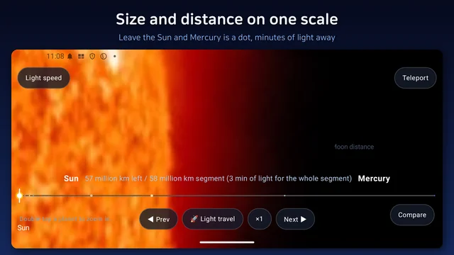
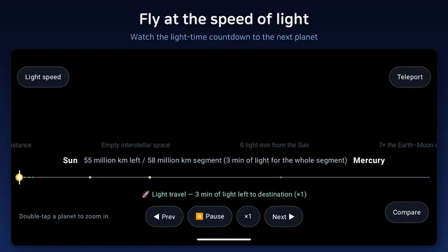
Swiping is the honest way to travel, but it can get long, so there is a second mode: pick a planet and fly to it at the speed of light, scaled to the same axis. A live countdown shows the remaining light-time, and there are ×1, ×10 and ×100 boosts, pause and resume, and an instant teleport for when you just want to be there.
This is the feature I am most attached to. "Nothing is faster than light" is a sentence everyone knows. Watching yourself travel at that speed and still not arrive is a completely different kind of knowing. Kids tend to hit ×100 straight away and then go quiet when Saturn still takes a while.
Planet size comparison without the distance
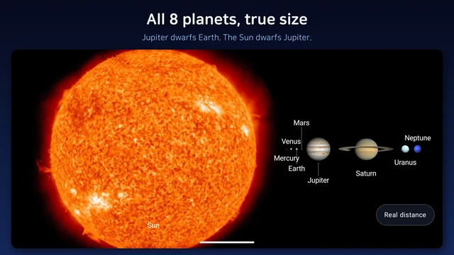
Sometimes you want the opposite question: forget the gaps, how big is Jupiter compared to Earth? A compare view lines up all 8 planets at the same magnification so you can look at planet size alone. Jupiter and Saturn dominate the row, Earth is a marble next to them, and Mercury is barely a dot. Pinch to zoom if you want to see the small ones properly.
Double-tap any planet and it opens as a large, real photograph from NASA's public-domain archive, again pinch-zoomable: Saturn's rings, the Great Red Spot, Earth's oceans. I deliberately used photos rather than illustrations, because children can tell the difference and they trust the real thing more.
Who this is for
- Parents who want to show a child how far apart the planets really are, without a lecture
- Teachers looking for a visual to go alongside the standard solar system chapter
- Anyone who has ever asked how long does light take to reach Neptune and wanted to feel the answer
- Space fans who enjoy being reminded how small everything is
The core of the app works offline; the network is only used when you open a high-resolution planet photo. It is landscape only, on purpose, so the axis has room to breathe. No account, nothing to sign up for.
Download (Google Play, free): https://play.google.com/store/apps/details?id=com.thefacegood.spacereal
※ Scale and distances are computed from published mean values; the actual orbits are elliptical, so real distances vary through the year.
If you try it and want a planet detail I have not included, or a hint that would help your kid, leave a comment. Most of the little labels in the app came from exactly that kind of message.


Comments
Post a Comment